Lightera

When three major fiber-optic companies came together to form Lightera, they approached OFC 2025 with focus and ambition. The goal was to introduce their unified identity with a strong, clear presence. “Creating Brighter Connections” guided every aspect of the booth experience. From the layout to the visual rhythm, every detail was designed to reflect the strength of the new brand and give visitors a reason to stop, look, and remember.

The Concept

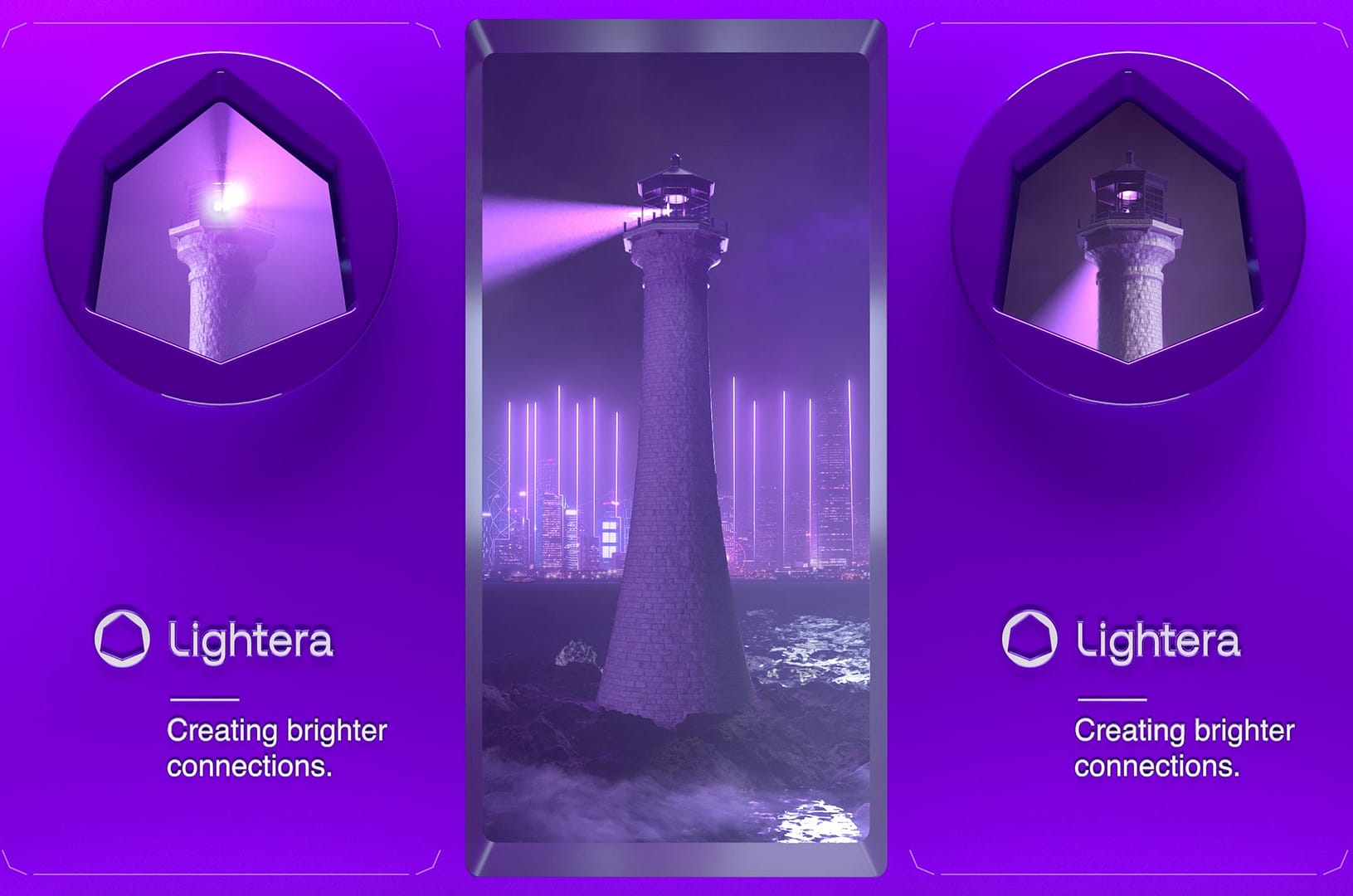
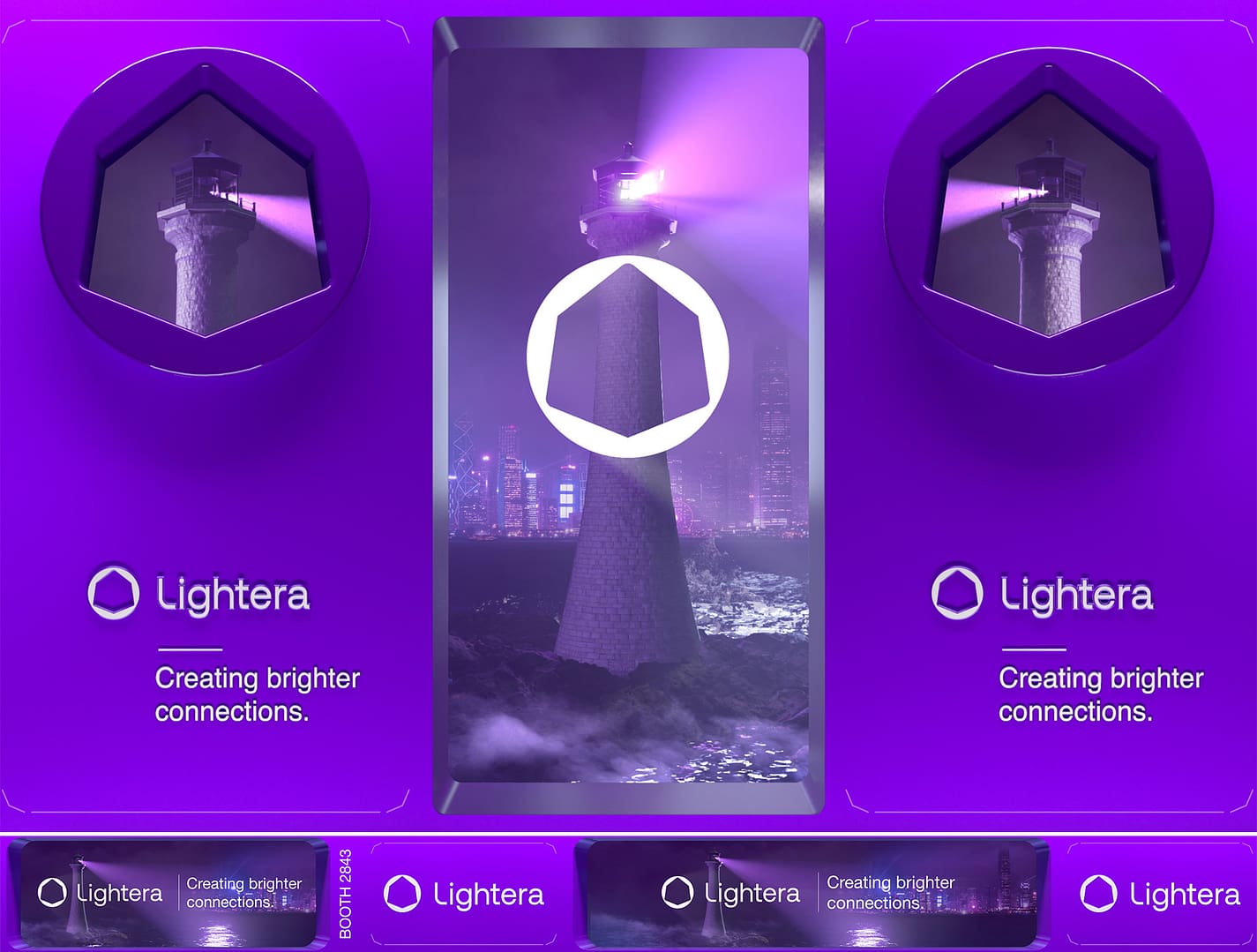
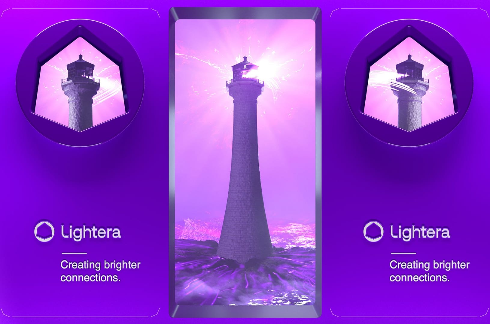
We built the creative around the idea of a Lighthouse Reveal, using it as a metaphor for clarity, connection, and guidance.

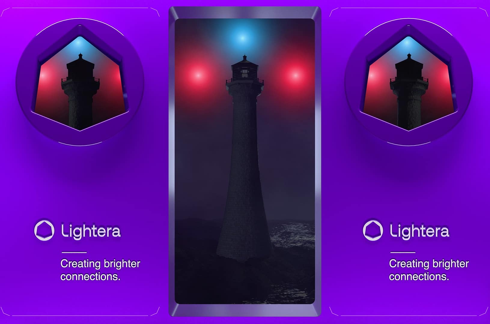
– Three glowing orbs, representing the legacy companies, converge into a single source of light.

– That light illuminates a lighthouse standing tall in the fog, its beam cutting across the booth.

– Dynamic light streaks burst outward, crossing the LED screen boundaries (aka breaking the 4th wall) and creating moments of anamorphic depth that pulled viewers into the scene.

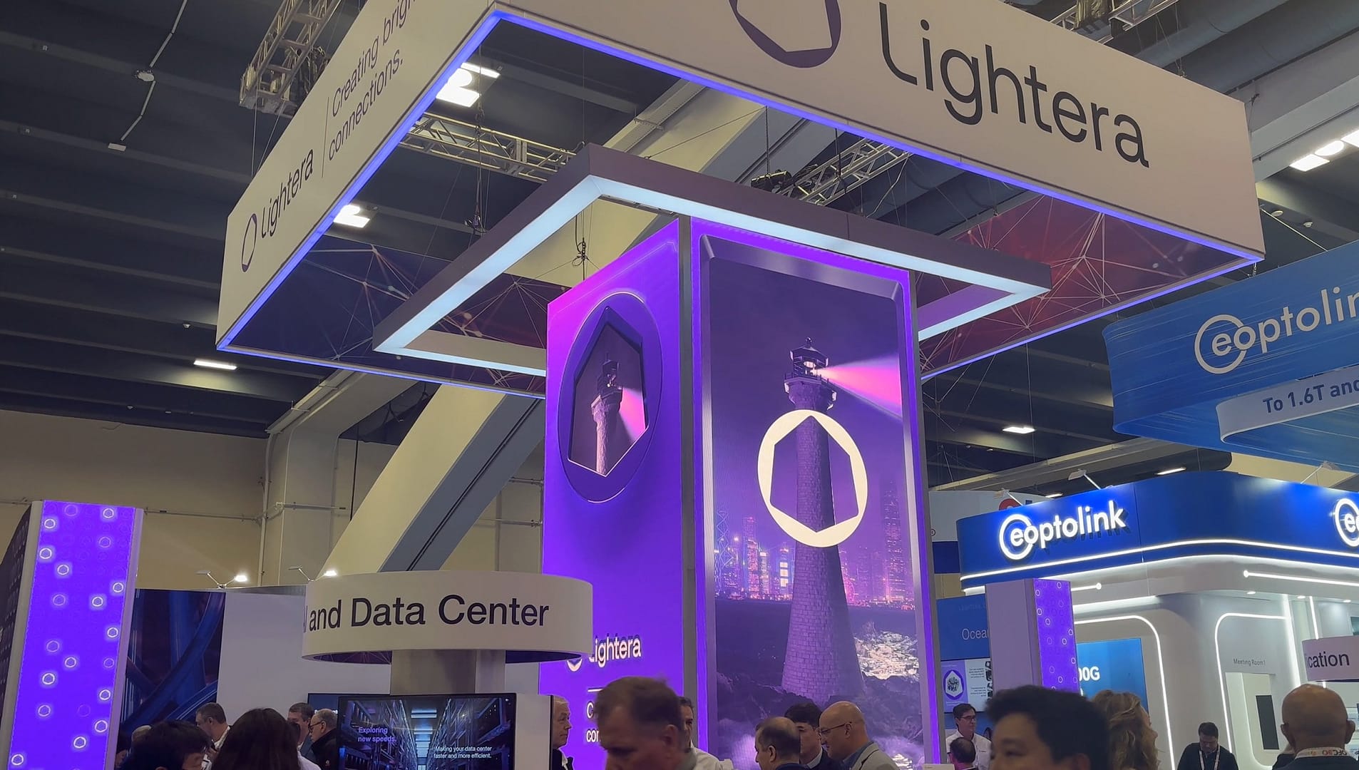
– The sequence culminates in the reveal of the new Lightera logo, glowing with energy and confidence before seamlessly resetting into the loop.

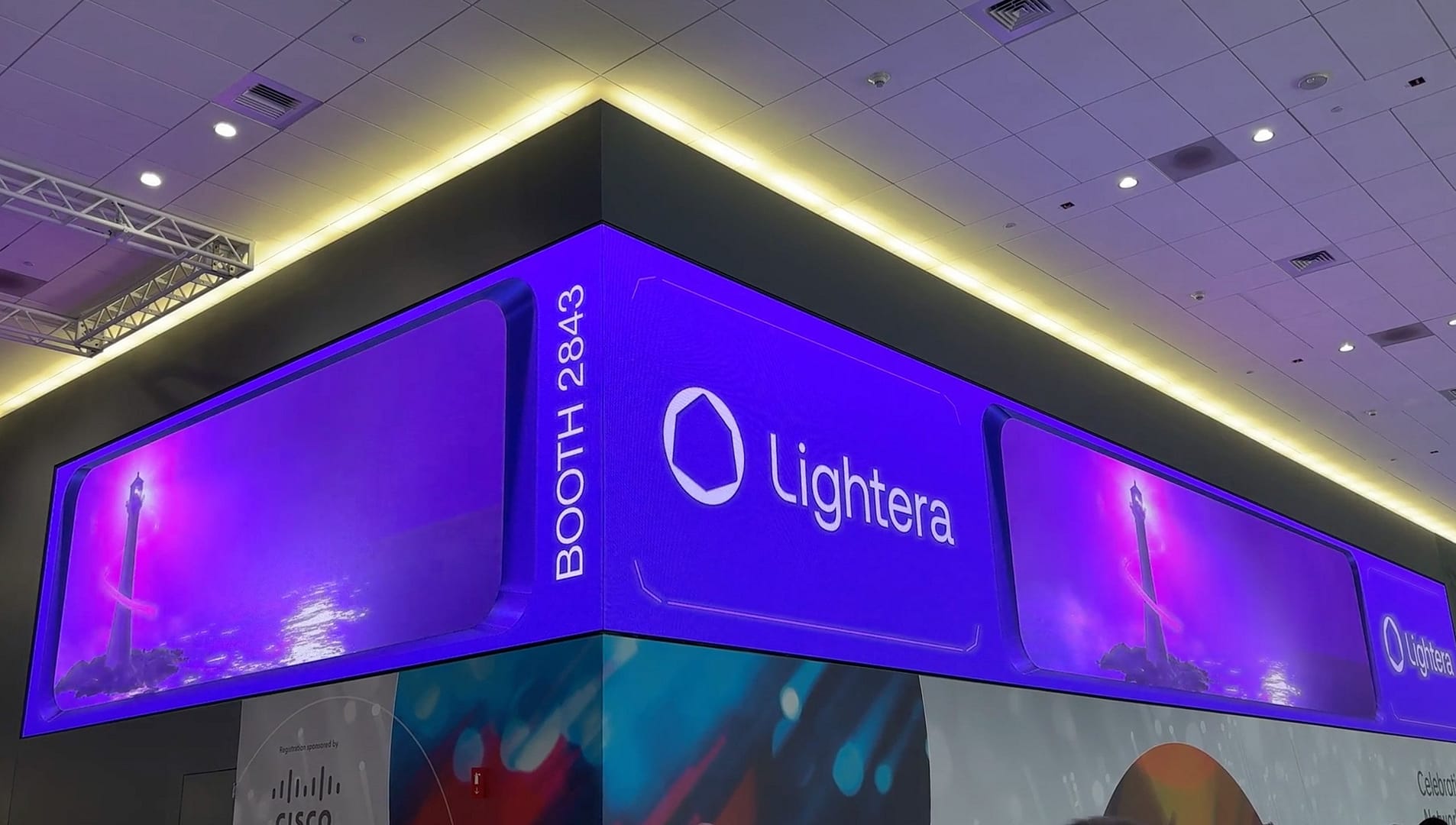
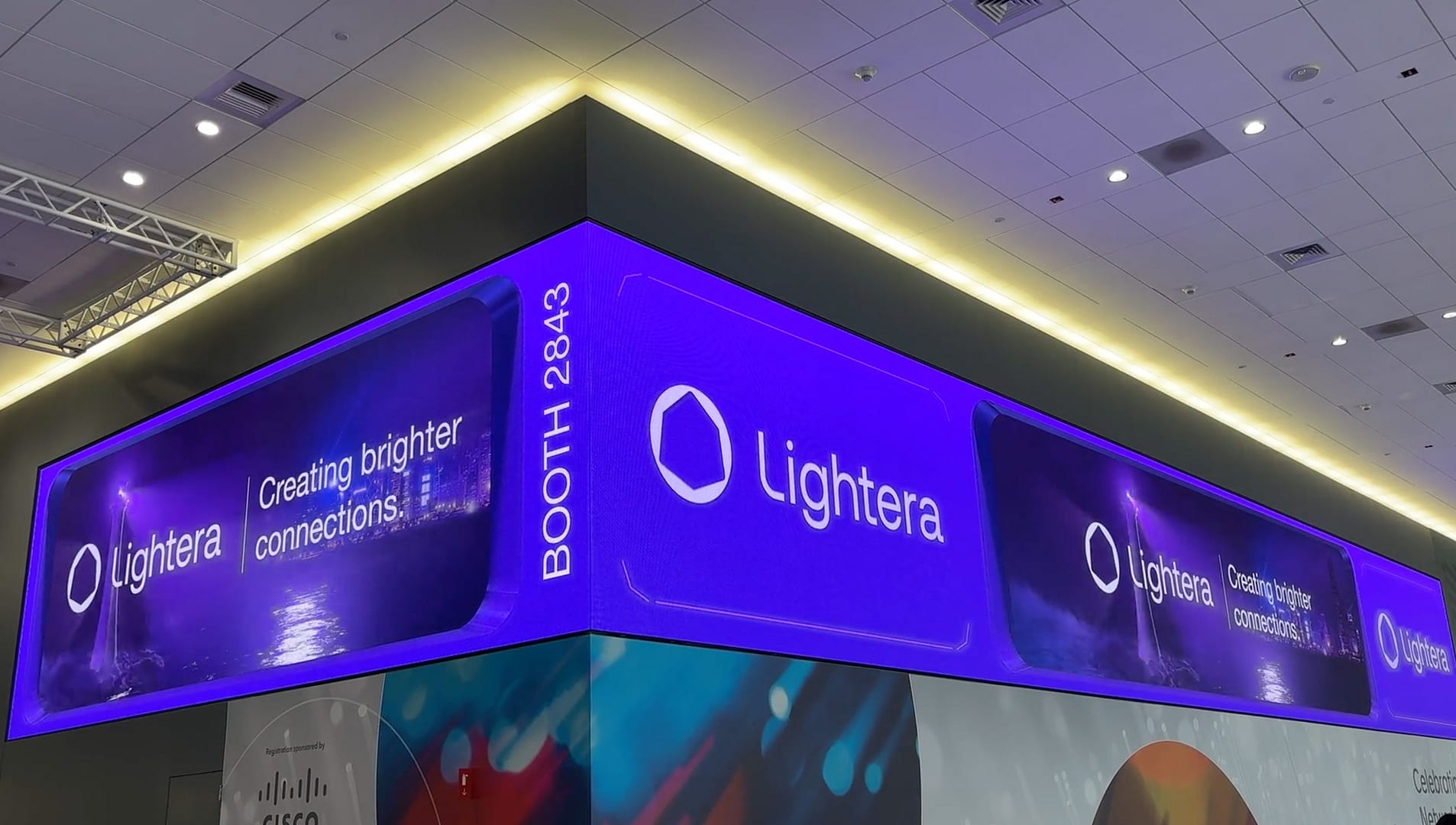
To extend the experience beyond the booth and produce a greater brand reveal, we also created 3D forced perspective content for a wide corner LED display, just outside of the expo hall entrance. This was a bold, :15 second brand loop that worked as both a teaser and a beacon, guiding attendees toward the booth and building anticipation before they even entered the show floor.
The Execution

Bringing the concept to life meant threading together creative ambition with technical accuracy. Each screen played a specific role in building a unified brand experience across the space:

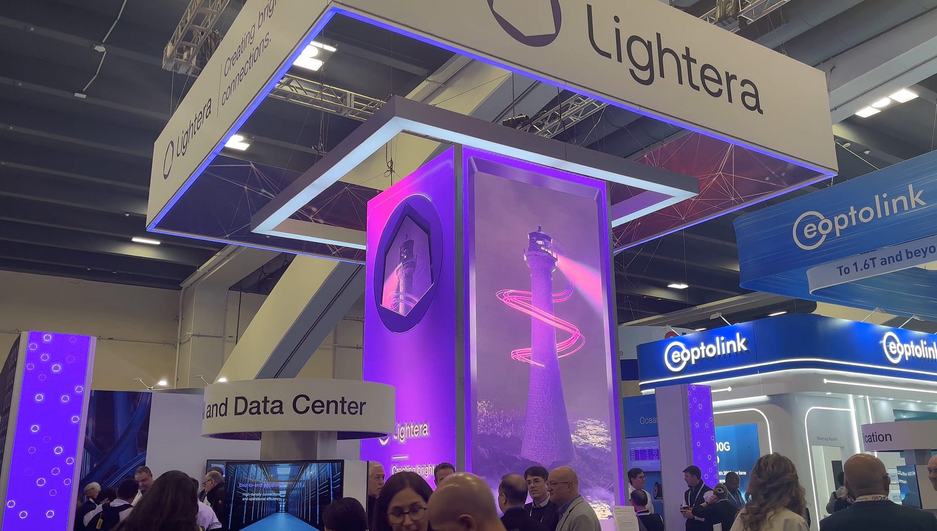
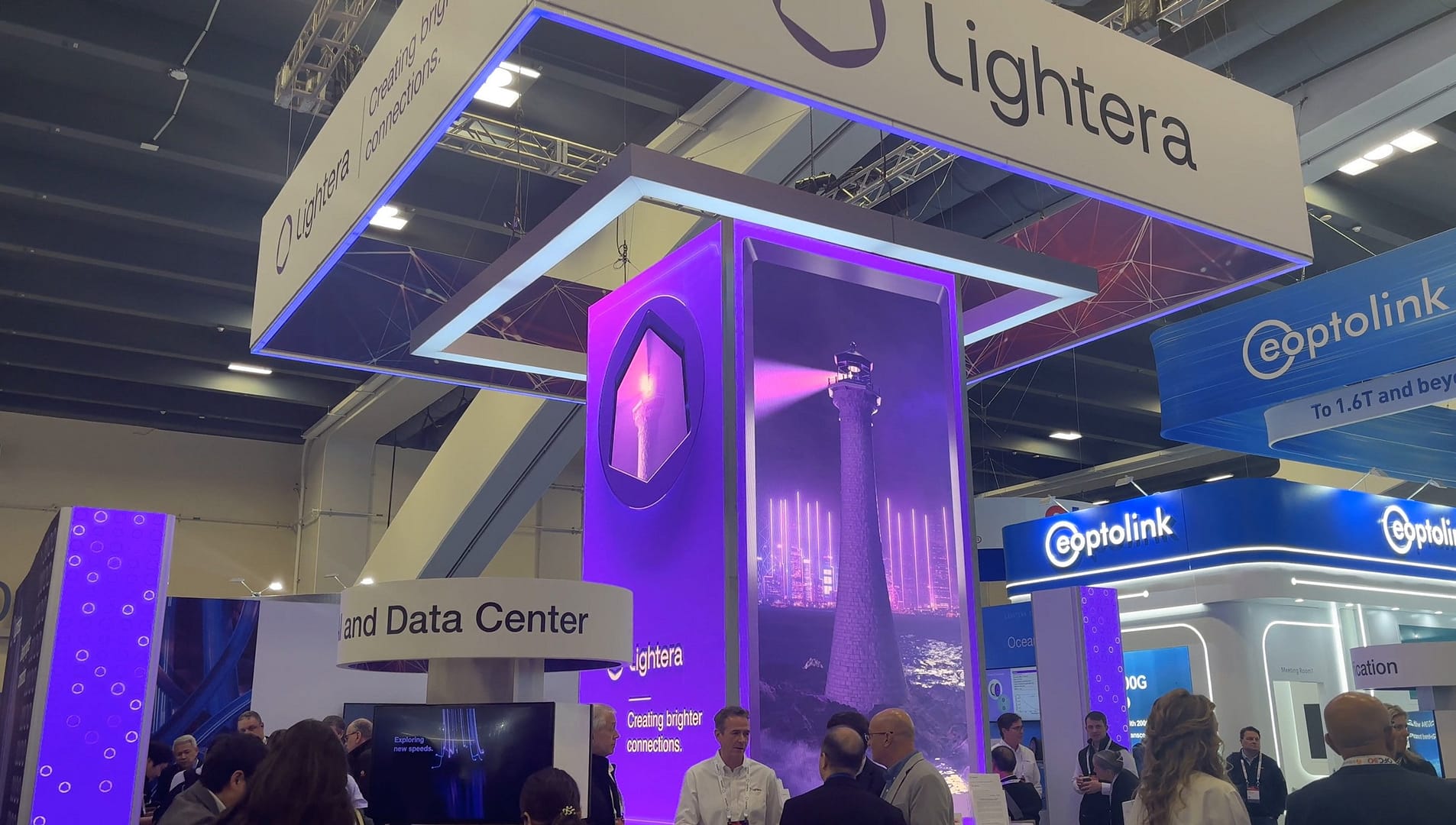
  • Booth Tower Screen (2304×1536): The centerpiece display, running the full Lighthouse Reveal sequence in a smooth 1-minute loop. Its scale and resolution gave the story room to breathe and unfold naturally.
  • Booth Column Screen (192×1536): A vertical extension of the tower’s animation, designed to reinforce the energy of the main screen and create a sense of elevation.
  • Hallway Ad Display (6048×576): A bold, fast-moving loop positioned in a high-traffic area only steps from the expo hall entrance. This piece served as an entry-point for the entire experience, catching eyes, creating brand awareness and directing attendees toward the booth.

At the time, Lightera’s brand guide was fresh off the press. With so many eyes on this debut, every detail had to line up. We worked hand-in-hand with their creative team to refine style frames, review renders, and lock in the pacing. Color palette, typography, and motion were all fine tuned to match the spirit and standards of the new brand from top to bottom.

Why It Worked

The content gave Lightera a distinct voice on the show floor. Each screen worked together to introduce the brand with clarity and confidence. The lighthouse served as a bold symbol: steady, purposeful, and unmistakable. It aligned closely with the company’s message. The hallway corner display helped build anticipation and guide visitors to the booth. Taken together, the full experience gave Lightera a strong sense of presence. It earned attention that felt genuine. For a first appearance, it looked and felt like they had already been part of the industry for years.

Client Feedback

John Lawrence, Digital Marketing Manager at Lightera, shared a simple but powerful comment: “Working with you was very easy and the quality of your work is outstanding.” His team made a point to capture footage of the content in action on site. There was a buzz around the launch that spread well beyond the booth. The content gave the brand an extra edge and helped turn a debut into a moment people remembered.

Reach Out Today

We want to hear from you. Contact us today about your upcoming project.

Start A Project