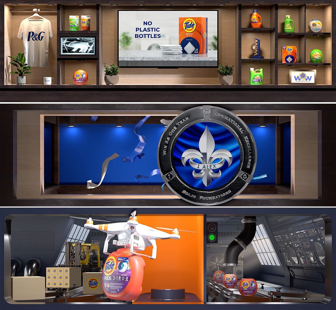
Procter & Gamble

The Challenge

P&G’s Alexandria Plant wanted its lobby to make an impact that reflected the company’s history, highlighted its products, and spoke clearly to its values. The goal was to welcome employees, visitors, and VIPs with a visual experience that felt purposeful and polished. A two-story wall had already been designed to hold a 21-by-6-foot LED display. The next step was to fill that canvas with something bold enough to serve as the anchor for a high-level plant tour that was already scheduled. It was a tight timeline: we had three weeks to concept, build, and deliver a modular 3D content package that could grow over time while still feeling finished on a quickly approaching day one.

The Concept

We created a virtual Story Case, a 3D forced-perspective display designed to feel like a permanent part of the space. The content blended symbolic brand objects with product storytelling in a format that looked polished and high-end.

The case served as the display’s resting state. At the center, a virtual screen with alpha transparency allowed the P&G team to easily update internal messaging while keeping the rest of the experience consistent and complete.

When triggered, the animation moved through three main phases:

  • Spotlight and Transition: The scene dimmed, and a spotlight highlighted the featured product. Virtual wooden doors, embossed with a glowing P&G/CBN medallion, slid shut across the screen.
  • Product Showcase: The doors reopened to reveal a 3D factory-themed environment. A drone delivered the featured product (Tide Pods for launch) onto a pedestal surrounded by conveyor belts, robotic arms, and a stylized packaging line, all referencing P&G’s manufacturing roots.
  • Logo Animation and Return: The final movement centered on the P&G medallion logo. Ribbons, electric bursts, and rotating chrome textures gave it visual energy. The scene then returned to the trophy case to begin the loop again.

The modular structure made it possible to launch quickly for the tour while leaving room for future product rotations and updates. Every element was created to reinforce the brand, fit the space, and deliver a polished, corporate-ready experience.

The Execution

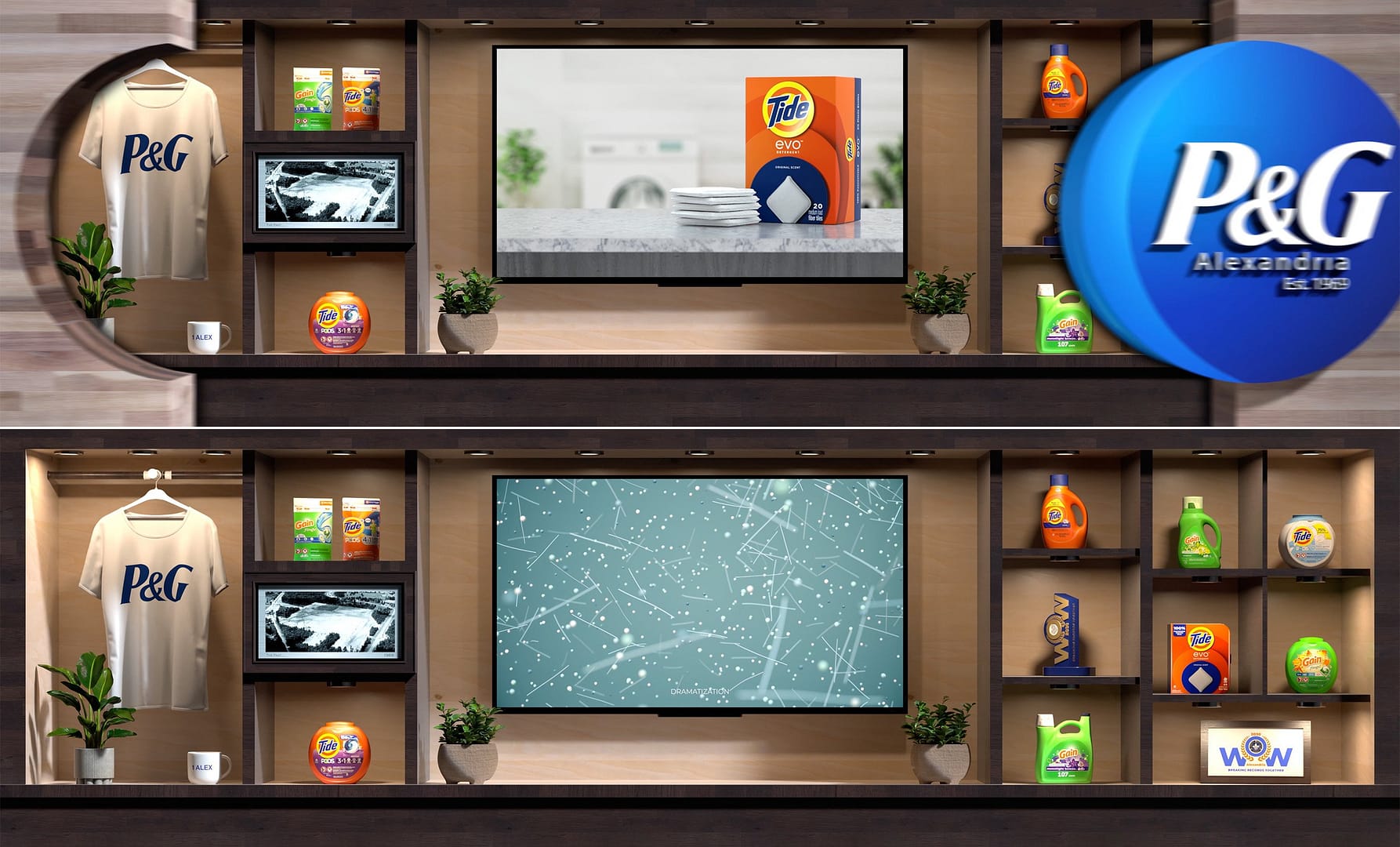
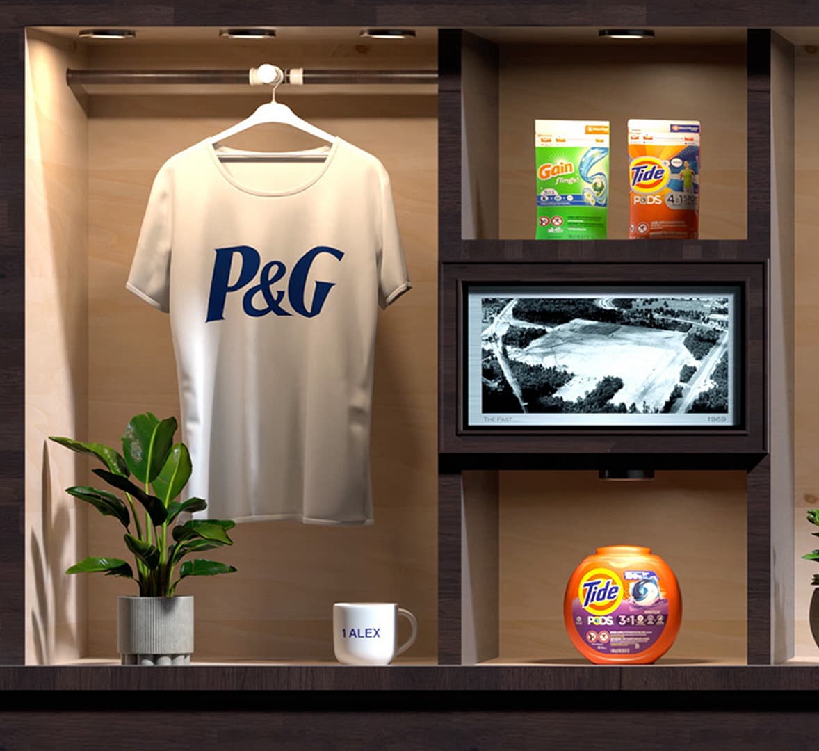
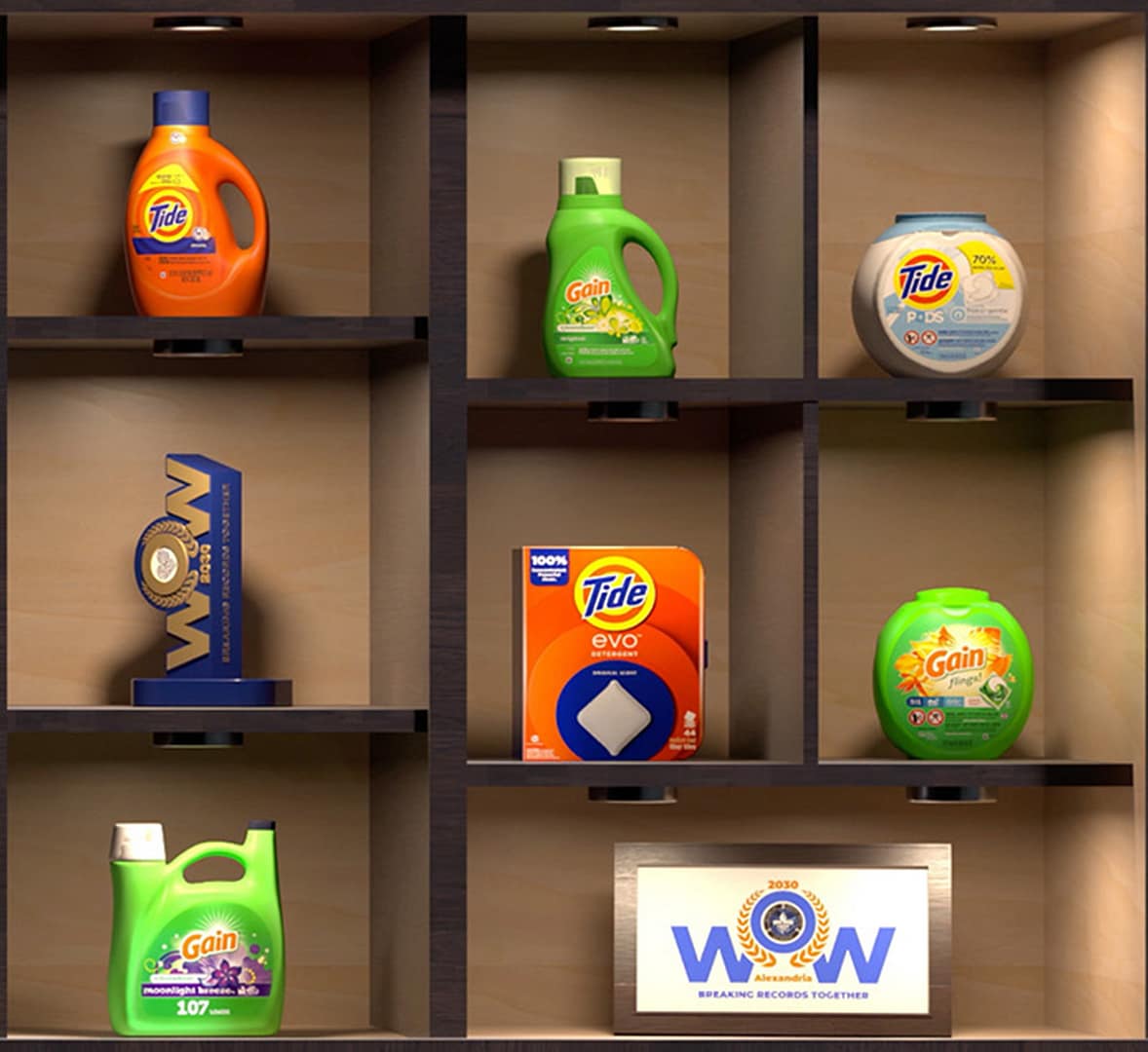
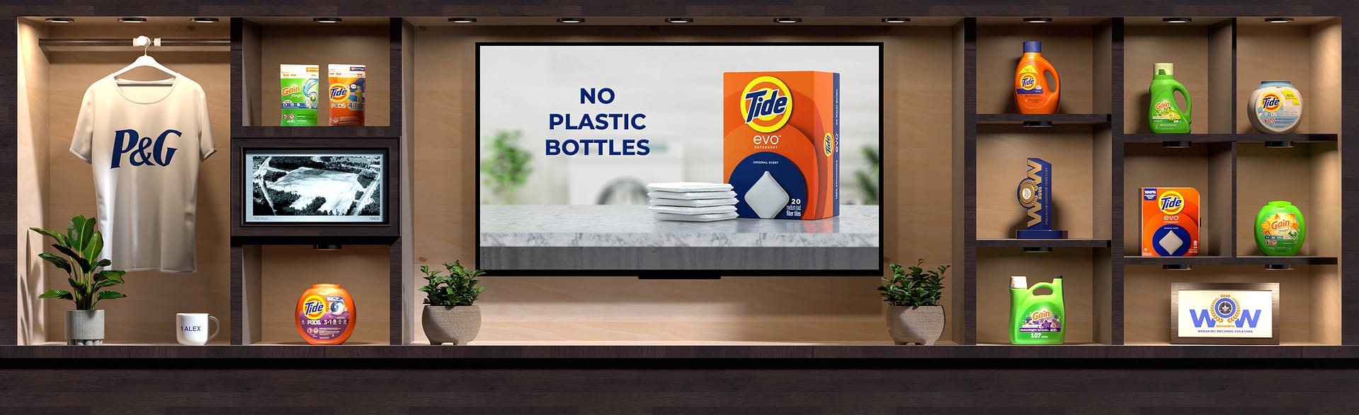
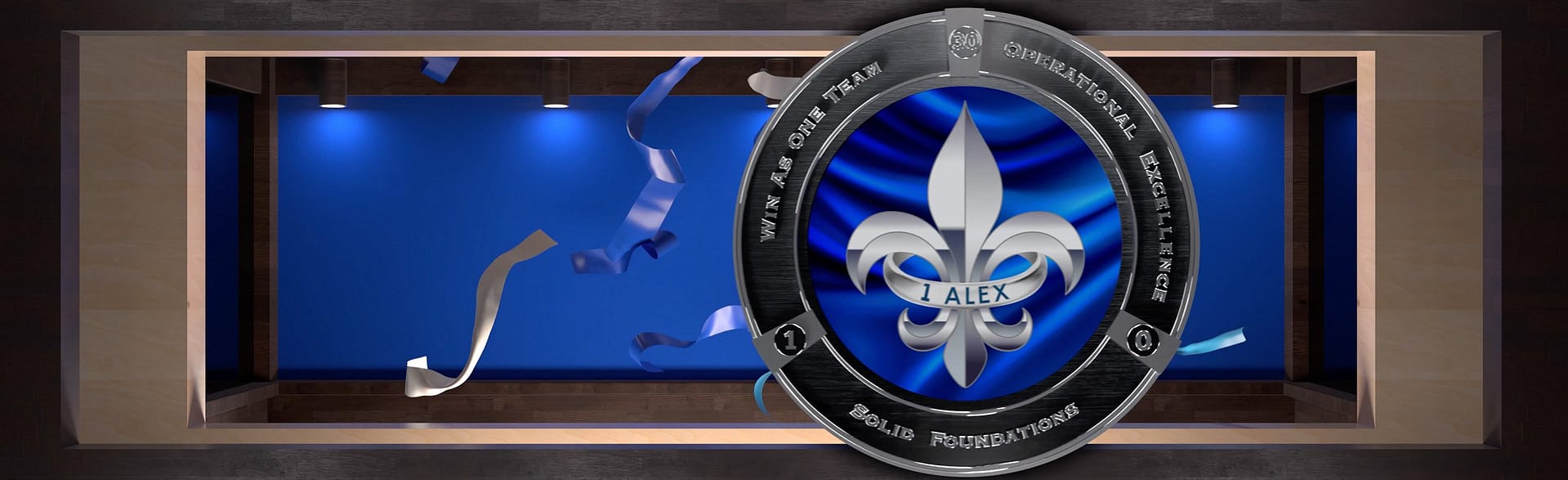
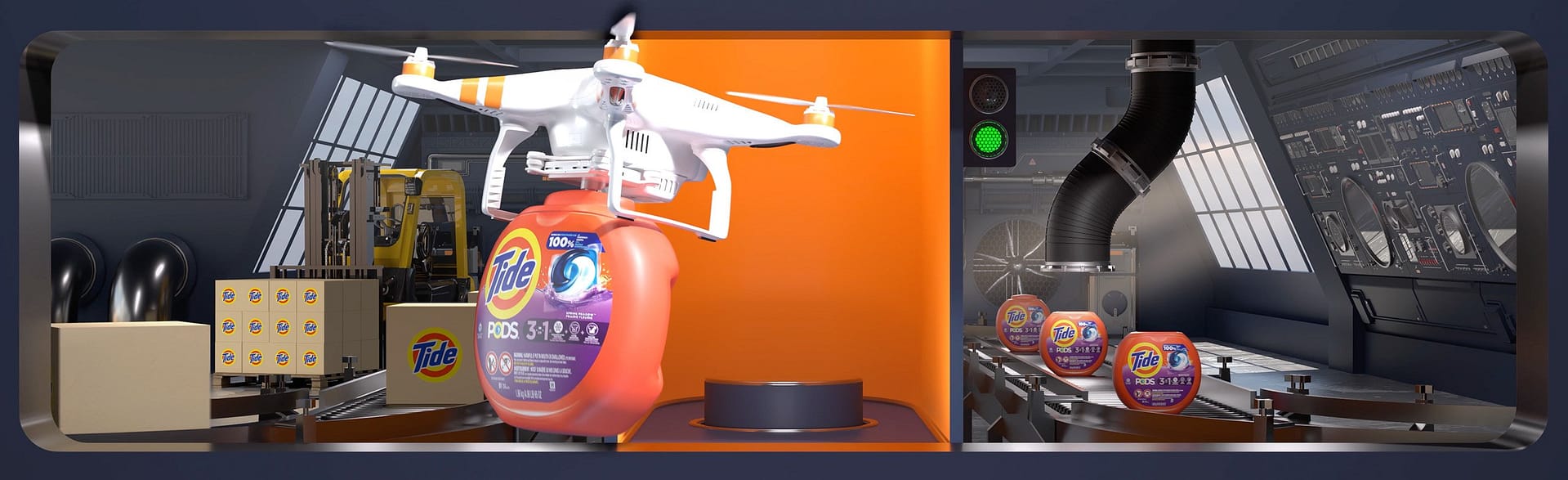
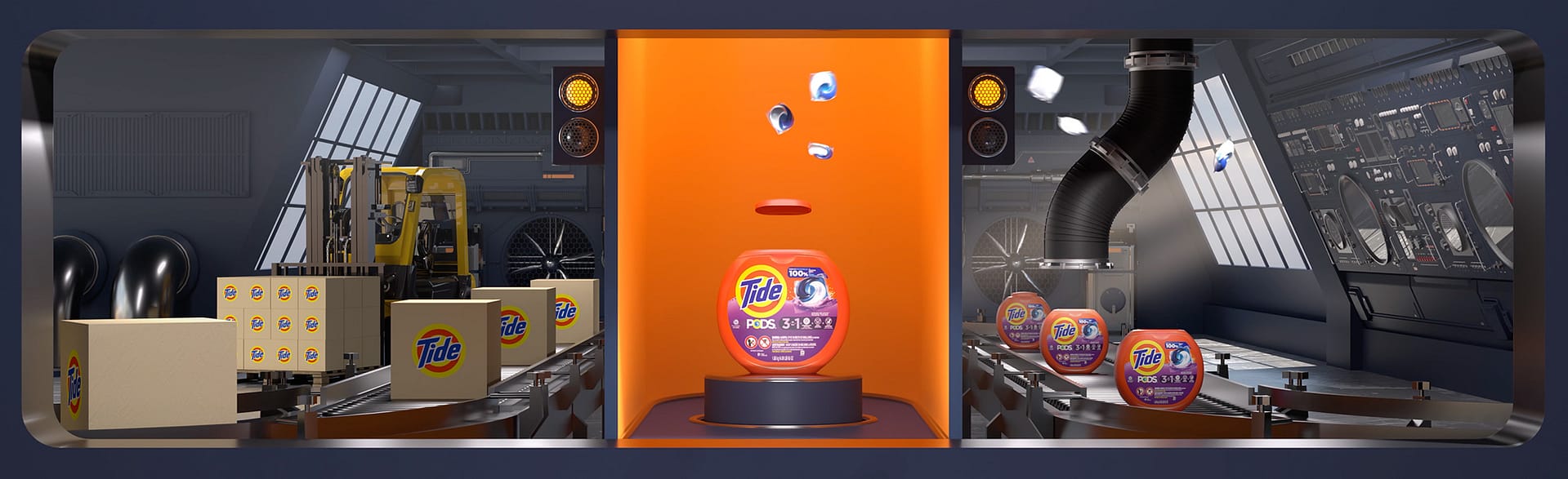
We built the Story Case with a focus on clarity, rhythm, and spatial depth. The virtual shelving was designed to feel architectural and intentional, working in harmony with the surrounding lobby features. Transitions were treated as visual turning points. The spotlight, the closing doors, and the medallion sequence were all staged to build anticipation before each product reveal. Inside the product showcase, exaggerated scale and dimensional depth helped anchor the scene. A drone, conveyor belts, and robotic arms brought movement and energy, tying the moment back to P&G’s heritage in manufacturing and logistics.

The sense of immersion came from the layering of visual depth. Forced perspective pulled elements forward, giving the illusion of real-world volume. Branded ribbons and accents of light added motion and polish without pulling focus from the product itself. The full sequence ran for two minutes and was designed to loop smoothly. Whether visitors paused for a moment or passed through daily, the content gave the lobby a sense of activity and presence.

Why It Worked

The installation delivered both professionalism and visual impact. Visitors were met with a standout moment that highlighted P&G’s legacy and forward-thinking approach. For employees, it served as a daily brand touchpoint, blending familiar elements with polished visual storytelling. The modular structure gave P&G room to grow the showcase over time, starting with Tide Pods and building out to feature additional products. By using alpha-channel integration, the internal team could update messaging easily without needing to overhaul the full animation. The final result added lasting value while keeping the content flexible and future-ready.


Client Feedback

The P&G team stayed closely involved throughout the process and gave strong feedback along the way. Marvin McLain supported the early creative direction, pointing out the symbolic objects and product details as standouts. The animated CBN logo earned praise, with one response describing it as “pretty banging looking in person.” Marvin gave quick, confident approvals on concept frames and transitions, using phrases like “perfect” and “beautiful,” which helped keep everything moving on a tight deadline. He also noted how the installation lifted the atmosphere of the space, with employees and visitors noticing fresh details each time they passed through. That reaction reinforced the strength of the content.

Before launch, Marvin made the team’s trust clear: “No questions, just want to make sure you have everything you need.”

Reach Out Today

We want to hear from you. Contact us today about your upcoming project.

Start A Project